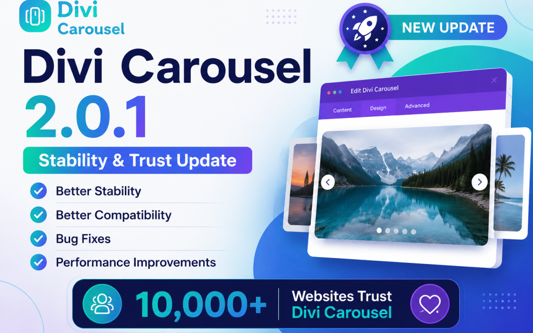
We’re excited to announce the release of Divi Carousel 2.0.1, a maintenance update focused on improving stability, compatibility, and overall reliability.
This release is part of our ongoing commitment to making Divi Carousel the most reliable carousel solution for Divi users.
What’s New in 2.0.1
This update focuses on fixing important issues reported by our community and improving the overall experience.
Improvements
Improved overall plugin stability
Better compatibility with the latest WordPress and Divi versions
Internal code improvements
General performance enhancements
Fixed
Fixed WordPress admin styling issue
Fixed PHP warning in the plugin loader
Improved plugin security and reliability
Fixed various compatibility issues
General bug fixes and code cleanup
Thank You
Your feedback helps shape Divi Carousel.
Every support ticket, feature request, and review helps us improve the plugin for everyone.
What’s Coming Next?
Our next update (v2.0.2) is already in development and will focus on improving our most popular modules, including:
Image Carousel
Testimonial Carousel
Product Carousel
Responsive improvements
Navigation improvements
This is only the beginning of our 2026 roadmap.
Thank you for being part of the Divi Carousel community.
Creating a Carousel Slider for Divi: WP Plugins and JS Packages
For showing the images, testimonial, product in slider or carousel enhance the user experiences generally use different types of wp plugin or js packages. This article will explore some of the most popular tools for creating a carousel slider in Divi, including WP plugins and JS packages such as Swiper.js, Slick, Glide.js, OwlCarousel2, Splide.js, and Swiffy Slider.
Understanding Carousel Sliders
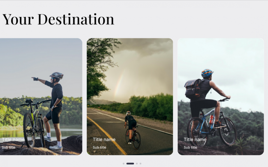
Carousel sliders are rotating sets of content, often used to display images, text, or videos. It provides a way to showcase multiple items in a limited space, allowing users to navigate through the content using arrows, dots, or swipe gestures. The dynamic nature of sliders makes them a popular choice for homepages, portfolios, and e-commerce sites.
WP Plugins for Divi Carousel Sliders
1. Divi Carousel Module
The Divi Carousel Module is a popular choice for adding carousels to your Divi website. It allows you to create image sliders, testimonial sliders, and more without any coding. The module integrates seamlessly with Divi, providing various customization options such as animation effects, slide duration, and navigation styles.
Smart Slider 3 is a powerful plugin that offers advanced features for creating carousels. With its intuitive drag-and-drop interface, you can build beautiful sliders in no time. It also provides numerous templates and design elements, making it easy to create unique and engaging sliders.
Slider Revolution is one of the most popular slider plugins for WordPress. It offers a wide range of features, including animated layers, full-screen sliders, and parallax effects. With its visual editor, you can create stunning sliders with ease. Although not specifically designed for Divi, it integrates well with the theme.
For those who prefer more control over their slider design, JavaScript packages offer a flexible alternative to plugins. Below are some of the most popular JS packages for creating carousel sliders.
1. Swiper.js
Swiper.js is a modern, mobile-friendly slider library known for its smooth transitions and touch-friendly features. It’s highly customizable and works well with Divi for creating image galleries, content sliders, and more.
Slick is a highly configurable slider library with numerous features such as lazy loading, autoplay, and custom animations. It’s easy to set up and integrates seamlessly with Divi, making it a great choice for building custom sliders.
Glide.js is a lightweight JavaScript library for building carousels and sliders. It focuses on performance and flexibility, making it an ideal choice for developers looking to create custom slider designs.
OwlCarousel2 is a popular and easy-to-use jQuery plugin for creating responsive carousels. It offers various options for customization and is compatible with Divi, making it a versatile choice for any website.
Splide.js is a lightweight and flexible slider library with a focus on performance and accessibility. It offers a wide range of features and is compatible with Divi for creating stunning sliders.
Swiffy Slider is a powerful slider library that supports a wide range of features, including parallax effects and animations. It is compatible with Divi and can be used to create eye-catching sliders with ease.
Once you have chosen the appropriate plugin or JavaScript package, integrating a carousel slider into your Divi website is straightforward. Here’s a step-by-step guide on how to do it:
Using a Plugin
Install and Activate the Plugin: Go to the WordPress admin dashboard, navigate to Plugins > Add New, and search for the desired plugin (e.g., Divi Carousel Slider 3). Install and activate it.
Create a Slider: Follow the plugin’s instructions to create a new slider. Customize it using the available options to fit your website’s design.
Add the Slider to Divi: Once the slider is created, use the Divi Builder to add it to your page. Most plugins provide a shortcode or module that you can insert into your layout.
Using a JavaScript Package
Include the JS Package: Download the JavaScript library (e.g., Swiper.js) and include it in your theme’s functions.php file or use a plugin like Code Snippets to add it to your site.
Create the HTML Structure: Add the HTML structure for the slider in the Divi Builder. Use custom modules or code snippets to include the necessary elements.
Initialize the Slider: Use custom JavaScript to initialize the slider and configure its options. Add the script to your page or theme to ensure it runs correctly.
Style the Slider: Use CSS to style the slider and match it with your website’s design. Customize the navigation, transitions, and other elements as needed.
Conclusion
Integrating a carousel slider into your Divi website can significantly enhance its visual appeal and user experience. Whether you choose a WordPress plugin or a JavaScript package, there are plenty of options available to suit your needs. By leveraging tools like Divi Carousel Module, Smart Slider 3, Swiper.js, and others, you can create stunning sliders that showcase your content effectively. Experiment with different features and customizations to find the perfect solution for your site.
Hello, everyone! In this tutorial, I’ll guide you on how to get an access token for Instagram, by using the Instagram Basic API for personal use. I’m creating this video because I understand how complex it can be to navigate the documentation and acquire an access token. My goal is to simplify this process for you. It’s a straightforward procedure, so let’s get started on this exciting journey of accessing Instagram data through the API.
In this tutorial, there are 9 simple steps to get the instagram access token.
Step 1: Sing up for meta for developers platform
Step 2: Access your dashboard
Step 3: Create a new app
Step 4: Provide App information
Step 5: Configure the app
Step 6: Add Product
Step 7: Setup Instagram Tester
Step 8: Accept Tester Invite
Step 9: Generate An Access Token
Step 1: Sign up for the Meta for Developers Platform
Instagram is now part of Meta, which means you’ll need to sign up for the Meta for Developers platform. This platform is where you’ll gain access to the necessary tools to interact with Instagram’s API. So, go ahead and complete this step to set the stage for the Instagram access token process.
Step 2: Access Your Dashboard
Once you’ve successfully signed in using your credentials (I used Facebook credentials), your dashboard should display all the apps you’ve created in the past. This is your starting point for managing your apps, including the one you’ll create to obtain the Instagram access token we’re discussing in this tutorial.
Step 3: Create a New App
To acquire an Instagram access token, the first step is to create an app. Click on “Create App” and select the “Consumer” option. We assume you’re doing this for personal use and not for a business Instagram account. Click “Next” to proceed with the app creation process.
Step 4: Provide App Information
Now, it’s time to provide some basic information about the app you’re creating. Think of a creative name for your app; for example, let’s call it “Instagram Carousel,” as it will be responsible for fetching photos from your Instagram page. After naming your app, click “Create App” and enter your password when prompted. This step is essential as it sets the foundation for obtaining the Instagram access token.
Step 5: Configure the App
With your app created, click on the “Basic” option. Indicate that you intend to build a website and proceed to provide the required site URLs. If you prefer, you can use a free domain for this purpose. You can also use a generic URL for the privacy policy and user data deletion, and plan to update them later. Click “Save Changes” to continue shaping your app.
Step 6: Add Products
Return to your dashboard and add the “Instagram Basic Display” product to your app. Scroll down and create a new app, ensuring you fill in the necessary redirect URLs. Additionally, you’ll need to add an Instagram tester, especially if you used your Facebook credentials for login and your Instagram account is not yet connected.
Step 7: Set Up Instagram Tester
Under the “Roles” section, add an Instagram tester by searching for your Instagram handle. Once you’ve entered your handle, submit the request, and this step ensures your Instagram account can interact with the app.
Step 8: Accept Tester Invite
Now, let’s switch to Instagram itself. Navigate to the settings tab on your Instagram account and manage access for tester invites. Accept the “Instagram Carousel” authorization request, which is an essential step in the process.
Step 9: Generate an Access Token
Returning to your app settings, scroll down to the “Instagram Test Users” section. Here, you should see your Instagram account listed. Click “Generate Token,” and follow the provided prompts to allow access. This is the final step to get the Instagram access token, and once completed, you’re ready to explore the possibilities it offers.
That’s it! You’ve successfully obtained your Instagram access token and developed exciting apps that interact with Instagram. I hope you found it helpful in your Instagram API journey.
Your CID comes in handy if Google creates a new record for your original listing.
A crucial use of the CID is connecting views for your listings on Local Finder, Google Maps, and Search. Sometimes, Google mixes up listings during events like suspensions, archiving, restoration, or duplication. In this tutorial, we will learn some ways how we will get the Google map CID number.
Using Google Maps (for non-Service Area Businesses)
Find your business listing:
Open Google Maps and search for your business name. Make sure it’s the only result that shows up.
Click on the address bar and replace “https://” with “view-source:”. Hit Enter.
Search for “ludocid”: Press Ctrl+F (Cmd+F on Mac) to open the search bar. Type “ludocid” and hit Enter.
Find your CID:
The CID number will be a string of numbers located after “ludocid\u003d” and before “\\”. Copy this number.
This is a very easy way to get the Google Map CID number within a minute. If you want to create a Google review carousel slider for your website you check here. Divi Google Review Carousel
The Facebook Feedback Carousel module is like a special tool inside the Facebook plugin. It’s here to make your website look awesome and work really well. Especially if you’re a web designer, it helps you showcase feedback in a super smooth and easy way.
This module is famous for its easy way of doing things, making displaying feedback look smooth and saving you time. It has lots of tools that are made to fit what designers need, like feedback items, settings, design choices, fancy customizing features, and more. And don’t forget, the feedback item feature lets you add special things to each feedback, while the overall settings change how the whole module looks.
Child Item
Before diving into the advanced features of the Facebook Feedback Carousel, let’s take a closer look at the Child Item, which empowers you to personalize each feedback individually. The Child Item has three primary sections:
Content Options
Design Options
Advanced Options
Child Item Content Tab
Within the Content tab of the Facebook Feedback Carousel Child Item, you’ll find essential elements that provide designers with the tools to tailor individual feedback within the module. Here’s a breakdown of these elements:
Facebook Page:
Facebook Page ID: This is the link to your Facebook page id. Everyone has their unique Facebook ID you need to provide your Facebook id here.
Facebook Page Access Token: Facebook page access token means with this token website can access your facebook feed. Provide this token to this field.
Show image : If you want your images in display , you can enable this help of this option.
Show content:If you want your content in display , you can enable this help of this option.
Show page name:Decide whether you’d like to display the name of your Facebook Page on the Carousel. “Yes” to show it, “No” to hide it.
Show post date: You can display every facebook feedback post by selecting to yes in this option.
Show button: Here you can add button to every carousel by enable it to yes.
Button(string field): If you’ve chosen “Yes” for the button option, specify the label or text that should appear on the button. For example, you can write “Learn More” or “Show more.”
Order Item:
This section lets you specify the order of elements within each Carousel item.
Image: Assign a number to set the position of the image within the Carousel item.
Author and Date Indicate the number that determines where the author and date information should be displayed.
Content: Specify a number for the content to determine its position within the Carousel item.
Button: Assign a number to set the placement of the button within each Carousel item.
Carousel:
In the Carousel section, you can configure various settings for your Divi Facebook Feedback carousel
Carousel Type: Here, you can pick the style for your carousel. You have two choices – Coverflow or Slider.
Slider per View: You can specify how many slides are visible simultaneously in your carousel.
Carousel Speed: Here, you decide how quickly or slowly your carousel moves.
Item Space Between: Here, you can set space between each item in the carousel.
Autoplay: Autoplay means your carousel scrolls automatically with this option. Here, you can enable this option.
Autoplay Delay: Define the delay between slides.
Slider Loop: Here, with this option you can make your carousel to play in an endless loop.
Center Slider: Choose whether a slide should be centered within the carousel.
Auto Height: Enable or disable the automatic adjustment of carousel height based on content.
Pause on Hover: Determine whether the carousel should pause when a user hovers their mouse pointer over it.
Navigation:
Navigation Show/Hide: Decide whether to display navigation arrows for your carousel.
Custom Arrow Icon: Pick where you want the navigation arrows to be placed vertically—center, top, or bottom.
Vertical Position: Here, pick where you’d like the navigation arrows to be vertically located, whether in the middle, at the top, or at the bottom.
Horizontal Position: You can set arrow alignment with this option. There are some options like left, right, centered, evenly spaced, or spaced around.
Icon Size: You can set the arrow icon size if you like. Here with this option, you can customize arrows.
Background Size: Here with this option, you can customize the arrow background as you like.
Background Size Hover: Define the background-size for the arrows when hovered over.
Radius: Adjust how round or sharp the arrow icons appear.
Icon Color: Icon Color means you can set any color as your preference for your navigation icon arrow.
Icon Color Hover: Set the color of the icons when hovered over.
Background Color: Set color for the background of you navigation arrows as you like.
Background Color Hover: Choose the background color when the arrows are hovered over.
Pagination:
Pagination Show/Hide: Decide whether to display pagination bullets.
Use Grab Cursor: Enable or disable the “grab” cursor effect for the bullets.
Use Keyboard Navigation: You can choose whether people can move through the carousel using their keyboard.
Use Mouse Navigation: Decide if users can navigate the carousel with their mouse.
Pagination Alignment: Pick where you want the pagination bullets to be: left, center, or right.
Bullet Type: Select the style of the bullets, whether simple bullets, fractions, or long active bullets.
Dynamic Bullet: Decide if the bullets should change dynamically based on the active slide.
Bullet Color: With this option, you can set your bullet color as. you like.
Bullet Size: With this option, you can set your bullet size as. you like.
Effect:
Slider Shadow: Enable or disable a shadow effect for the carousel.
Slider Rotate: Adjust the rotation of the carousel.
Slider Stretch: Change the stretching effect of the carousel.
Slider Depth: Control the depth effect of the carousel items.
Link:
You can make each carousel have its own special web link. When someone clicks on a carousel, it can take them to a particular spot on your website or even open a completely new tab with a different webpage. This is really useful if you want each carousel to send people to different places when they click on it. It makes your carousel clickable and interactive. Inside the Link Option, there are two important things:
Module Link URL: The module link URL is like the web address you choose for your item. It’s where you decide where visitors go when they click on your Carousel. It’s like setting the path to where you want them to go on the internet.
Module Link Target: Here, you have two choices. One option is to make it so that when someone clicks on the carousel, the new page opens in the same window. The other option is to make it open in a completely new tab or window. It’s up to you how you want it to
Background:
In the Carousel’s background settings, you’ve got some amazing tools to make your design stand out and grab attention! Here’s what you can do:
Background Color: You can set the color for the background here. Using this option you can choose any color for the background.
Add Images or Videos: Here, you can choose the image for the carousel background as you like. Also, you can choose videos for the background of the carousel
Patterns: You can make your background look stylish by adding patterns. It’s like giving it a cool design.
Background Masks: You can make your carousel background more interesting by adding it background mask.
Admin Label:
This label is used to identify and manage the Instagram Carousel module in the admin area of your website. It helps you quickly locate and work with this specific module when editing your site’s content.
Child Item Design Tab
Within the Design Tab for each piece of feedback in the Facebook Feedback Carousel, you have the power to enhance the appearance of each feedback item. There are various design options at your disposal that are very user-friendly. You can easily create engaging effects like changing the look when someone hovers over a feedback item, fine-tuning captions and buttons, adjusting spacing around the feedback, and even applying borders or filters to alter how the feedback appears. Don’t be intimidated; it’s much simpler than it may seem. Just follow the guidance below.
Slide Item
In the Slide Item, you have the flexibility to add background color, background hover color also border radius, customize the border style, and even apply a unique box style. These options give you the freedom to create visually appealing designs for your slides.
Image:
Carousel Image Settings allow you to customize the appearance of your carousel images to match your preferences.
Image Size: Use this to adjust the size of your carousel images.
Image Alignment (left, center, right): Select where you want your images to align on the carousel.
Image Border Rounded Corners: Round the edges of your images for a smoother look.
Image Border Styles: Pick your preferred border style for images.
Image Border Width: Decide if you want a thick or thin border around your images.
Image Border Color: Choose any color you like for the border around your images.
Image Border Style: Select the style of the border (solid, continuous line, or dashed).
Box Shadow: Add a shadow effect to give your images a 3D appearance.
Content:
In this section, you can easily change the text styles for your content. Whether you want to adjust the font, size, color, or other styling elements, this feature allows you to customize the appearance of your heading text to match your design preferences.
View Post :
In this section, you can easily change the text styles for your post also can change the button alignment, background color and background hover color. Whether you want to adjust the font, size, color, or other styling elements, this feature allows you to customize the appearance of your heading text to match your design preferences.
Author:
In the Author section, you can easily change the text styles for your headings. Whether you want to adjust the font, size, color, or other styling elements, this feature allows you to customize the appearance of your heading text to match your design preferences.
Date:
This allows you to control how the date text within your carousel looks. You can adjust various aspects of the text to suit your preferences.
Font: You can choose a font style as your preference. Like Abel, Actor and many more as you like.
Font Weight: You can decide how thick or thin the characters in your text appear. It’s like choosing between regular and bold.
Font Style: You can choose the font style as your preference. If you want your font to be italic, right, underlined, or many more you can do that.
Text Alignment: You can choose the text alignment as your preference. If you want your text to be on the left, right, or centered, you can do that too.
Text Color: This is where you pick the color for your text. You can choose any color you like.
Text Size: Text Size is where you can choose your text size. Here you can adjust size according to your taste.
Letter Spacing: You can choose the letter space as your preference. With this menu, you can add custom space between letters.
Line Height: Line Height is where custome height of text lines. With this, you can choose your custom line height for your text.
Text Shadow: On this menu, you can add shadow to your text, there are many more options of shadow you can choose what you like.
Custome Spacing:
Caption Spacing in the Carousel is your personal design assistant for getting the look you want. It’s your tool to arrange and display your facebook feedbacks exactly the way you envision. You’re the boss, ensuring everything appears just right. This feature helps you create an appealing and well-organized facebook feedback showcase that matches your website’s style seamlessly.
Custom Spacing in the Carousel consists of two parts: “Wrapper” and “Content.” Let’s break them down for you:
Text:
Text allows you to control how the text within your carousel looks. You can adjust various aspects of the text to suit your preferences.
Font: You can choose a font style as your preference. Like Abel, Actor and many more as you like.
Font Weight: You can decide how thick or thin the characters in your text appear. It’s like choosing between regular and bold.
Font Style: You can choose the font style as your preference. If you want your font to be italic, right, underlined, or many more you can do that.
Text Alignment: You can choose the text alignment as your preference. If you want your text to be on the left, right, or centered, you can do that too.
Text Color: This is where you pick the color for your text. You can choose any color you like.
Text Size: Text Size is where you can choose your text size. Here you can adjust size according to your taste.
Letter Spacing: You can choose the letter space as your preference. With this menu, you can add custom space between letters.
Line Height: Line Height is where custome height of text lines. With this, you can choose your custom line height for your text.
Text Shadow: On this menu, you can add shadow to your text, there are many more options of shadow you can choose what you like.
Spacing
Spacing options let you control the distance and positioning of your carousel within its container.
Margin (Top, Bottom, Left, Right): Adjust the space between the carousel and its surroundings. You can increase or decrease the space on each side individually.
Padding: Adjust the space between the content inside. You can increase or decrease the space on each side individually.
Border
Borders help define the outline of your carousel.
Rounded Corners: You can choose the appearance of the border if you want your carousel border rounder you can adjust this from this menu.
Border Style: you can choose the appearance of the border. You can have a solid continuous line or a dashed line with gaps.
Border Width: Control the thickness of the border around your carousel.
Border Color: With this option, you can add custom to your carousel border which suits your carousel most.
Box Shadow
Box Shadow can give your Facebook Feedback carousel a subtle 3D effect.
Box Shadow: Add a shadow to make your carousel look like it’s floating or slightly elevated.
Filter
Filters allow you to adjust the visual properties of your Facebook Feedback carousel.
Hue: Change the color tone of your carousel.
Saturation: As color is added but you want to adjust the color intensity with this option you can do that also.
Brightness: Brightness gives you the control to make your Facebook Feedback appearance darker or brighter as you like.
Contrast: Contrast is used to make darker and lighter areas more even. We have that menu also with this you can make your Facebook Feedback more even.
Invert: Using invert you can make your Facebook Feedback dark areas light and light areas light.
Sepia: Apply a warm brownish tone to your carousel.
Opacity: Control how transparent or solid your carousel appears.
Blur: With this blur customization you can add softness to your Facebook Feedback carousel, and make it more smooth using this menu.
Blend Mode: You can choose your own preference mode that blends your Facebook Feedback to the background more smoothly. We have many different options of blend mode you can choose what you like.
Transform
Transform options allow you to change the position and orientation of your Facebook Feedback carousel.
Transform options allow you to change the position and orientation of your Facebook Feedback carousel.
Transform Scale: With this option, you can resize your Facebook Feedback carousel as you prefer.
Transform Translate: Using this translation you can move your Facebook Feedback carousel horizontally or vertically.
Transform Rotate: On this menu, you can rotate your Facebook Feedback as you like. We have multiple options where you can adjust your Facebook Feedback as you like.
Transform Skew: Skew your carousel to create a slanted effect.
Transform Origin: Set the point around which your carousel is scaled, rotated, or skewed.
Animation:
The animation effect setting is a part of all Divi default modules, including the Divi Facebook Feedback Carousel. It offers seven different effects and additional options to make your animated section look visually appealing.That’s happening in a photo. So, you can choose whether to have these captions visible or not in your carousel. It’s a neat way to give your website visitors some extra info and make your feedbacks more engaging.
Divi Facebook Feedback Carousel Advance Tab
You can do everything you need in the Content and Design tabs, so use them for your convenience. But if you want even more control, the Advanced tab in Divicarousel’s Facebook Feedback Carousel lets designers fine-tune every element using CSS ID & Classes and other Custom CSS code. Plus, it offers settings for visibility, transitions, position, and scroll effects to make everything work smoothly.
Class ID & Class
CSS ID: The CSS ID is used to uniquely identify the element when you want to link, script, or style it separately.
CSS Class: You can assign one or more CSS classes to the element, separated by spaces. These classes allow you to apply custom CSS styles either from your child’s theme or Divi’s custom CSS inputs.
Custom Css
In the Divicarousels Facebook Feedback Carousel module, there are various places where you can add your custom CSS code. Each CSS input box has a “?” symbol, which indicates the targeted class for your reference.
Condition:
Conditions help you control when and where the child item appears on your website.
Visibility:
Visibility settings in Facebook Feedback Carousel are about controlling when and where the carousel appears.
Disable On (Phone, Tablet, Desktop): This feature allows you to choose on which devices (phone, tablet, desktop) you want to hide or show your carousel. For example, you can hide it on phones and display it only on tablets and desktops.
Horizontal Overflow (Visible, Scroll, Hidden, Auto): It determines what happens when the carousel’s content extends beyond the available horizontal space. You can choose to make it visible, enable scrolling, hide it, or let the browser handle it automatically.
Vertical Overflow (Visible, Scroll, Hidden, Auto): Similar to horizontal overflow, this setting controls what occurs when the carousel content extends beyond the vertical space. You can decide to make it visible, allow scrolling, hide it, or let the browser manage it automatically.
Transitions:
Transitions and scroll effects are what give your Facebook Feedback Carousel its unique flair, making your feedback pop and engage your audience. Transitions are like the smooth moves for your feedback, making it appear and disappear in a cool way.
Transitions Duration: This determines how fast or slow your feedback appears.
Transitions Delay: Decide if there should be a little pause before your feedback starts to move.
Transitions Speed Curve: This defines how your feedback moves, whether it starts slow and goes fast or the other way around.
Position:
Position is about deciding where your feedback should sit on your webpage.
Position: Here, you can adjust you facebook feedback position.
Z Index: You can decide where your feedback item should appear compared to other things on your webpage.
Scroll Effects:
Sticky Position: It’s like making your feedback stick in one place as people scroll, ensuring it stays on the screen.
Scroll Transform Effect: Add special effects to your feedback as people scroll, making it visually captivating.
Enable Vertical Motion: Make your feedback movable to create a dynamic effect.
Motion Effect Trigger: Decide when these special up-and-down movements should happen as people scroll, adding an extra layer of engagement.