Getting Started
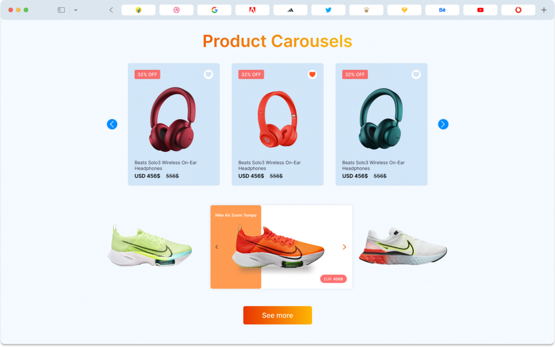
Divi Product Carousel module is your go-to solution for displaying your products in style. Whether you’re a web designer or just someone who wants to display products beautifully, this module is your go-to tool.
What makes this module stand out is its user-friendly approach, making the process of showcasing products an easy task. With this powerful tool, you can showcase your products, complete with prices, descriptions, ratings, and a variety of display options. It is your canvas to exhibit your products just the way you want.
It has lots of tools that are made to fit what designers need, like child items, content options settings, design options settings, advanced customizing features, and more. And don’t forget, the child item feature lets you add special things to each Product, while the overall settings change how the whole module looks.
Child Item – Divi Product Carousel
Before delving into the Product Carousel’s advanced features, let’s explore the Child Item, which allows you to customize each product individually. The Child Item comprises three key sections:
- Content Options
- Design Options
- Advanced Options
Child Item Content Tab:
In the Content tab of the Divi Product Carousel Child Item, you’ll discover important elements that allow designers to customize individual products within the module. Here’s a breakdown of these elements
Products:
On Child item option products give you that control you can showcase your product as your preference. Here’s what can you do:
- Product criteria: using product criteria you can choose what serves best for your website goals. You can choose your desired product showcase option as you like. We have the options are recent products, featured products, sale products, best-selling products, top-rated products, and custom product filters.
- Number of Products: With this option, you can choose how many products you want to showcase on your product carousel. For example, If you choose 5 your product carousel will show 5 products at a time.
- Show Product Image: On this option of show product image you can set product image set on display.
- Show Product Title: You have the freedom to show or hide the titles of your products: You can make a choice regarding whether you want to display the product title or not. If you go for “Yes,” the product title will be displayed. If you prefer “No,” the title will not be shown.
- Show Product Price: You have the freedom to show or hide the prices of your products. If you go for “Yes,” the product prices will be displayed. If you prefer “No,” the prices will not be shown.
- Show Product Rating: You can make a choice regarding whether you want to display product ratings. If you select “Yes,” the product ratings will be visible to your visitors. If you go for “No,” the ratings will be concealed.
- Show Product Description: You can determine whether you want to showcase the descriptions of your products. By selecting “Yes,” the product descriptions will be presented. If you go for “No,” the descriptions will be hidden.
- Show Details Button: You can include a “Details” button with your products. If you decide on “Yes,” a button labeled “Details” will be added to your products. If you prefer “No,” this button will not be included.
- Button: You can personalize the name of the “Details” button to align with your website’s style. You have the flexibility to name it as you see fit.
Order Item:
- Image: You can make a choice regarding whether you want to display product image.
- Title: You can make a choice regarding whether you want to display product title.
- Content: On this option, you can make a choice regarding whether you want to set the order of the product content display.
- Price: Here, you can select how product prices are ordered.
- Rating: You can make a choice regarding whether you want to display product ratings.
- Button: On this option You can set order button for product.
Carousel Item:
- Carousel Type: On this option you can select carousel style ,choose between Coverflow and Slider.
- Slide Per View: You can specify how many slides, or products, are visible simultaneously in your carousel.
- Carousel Speed: Here, you decide how quickly or slowly your carousel moves.
- Item Space Between Determine the space or gap between each item (product) in the carousel.
- Item Space Between Determine the space or gap between each item (product) in the carousel.
- AutoPlay: On this option you can set product carousel automatic scrolling automatically.
- AutoPlay Delay: Define the delay between slides.
- Slider Loop: On this option, you can set the product carousel in the loop.
- Center Slide: Choose whether a slide should be centered within the carousel.
- Auto Height: Enable or disable the automatic adjustment of carousel height based on content.
- Pause on Hover: Determine whether the carousel should pause when a user hovers their mouse pointer over it.
Navigation Item:
- Navigation Show/Hide: Decide whether to display navigation arrows for your carousel.
- Custom Arrow Icon: On this option, you can customize your arrow with your preference.
- Vertical Position: Select where the navigation arrows should be vertically positioned, whether in the center, at the top, or at the bottom.
- Horizontal Position: Choose how the arrows are aligned horizontally, whether justified, centered, left, right, spaced evenly, or spaced around.
- Icon Size: Adjust the size of the navigation arrow icons.
- Background Size: Set the background size for the navigation arrows.
- Background Size Hover: Define the background size for the arrows when hovered over.
- Radius: This controls the roundness of the arrows.
- Icon Color: Choose the color of the navigation arrow icons.
- Icon Color Hover: Set the color of the icons when hovered over.
- Background Color: Select the background color of the navigation arrows.
- Background Color Hover: Choose the background color when the arrows are hovered over.
Pagination Item:
- Pagination Show/Hide: Decide whether to display pagination bullets.
- Use Grab Cursor: Enable or disable the “grab” cursor effect for the bullets.
- Use Keyboard Navigation: Determine whether users can navigate through the carousel using keyboard controls.
- Use Mouse Navigation: Decide if users can navigate the carousel with their mouse.
- Pagination Alignment: Choose where the pagination bullets should be aligned: left, center, or right.
- Bullet Type: Select the style of the bullets, whether simple bullets, fractions, or long active bullets.
- Dynamic Bullet: Decide if the bullets should change dynamically based on the active slide.
- Bullet Color: Choose the color of the pagination bullets.
- Bullet Size: Adjust the size of the bullets.
Effect Item:
- Slider Shadow: Enable or disable a shadow effect for the carousel.
- Slider Rotate: Adjust the rotation of the carousel.
- Slider Stretch: Change the stretching effect of the carousel.
- Slider Depth: Control the depth effect of the carousel items.
Child Item Design Tab:
In the Design Tab for each product in the Product Carousel, you can make each part of a product look really nice. There are some special design options that are quite helpful. You can do things like making changes when someone hovers over the product, adjusting title, and buttons, spacing around the product, and borders, and using filters to change how the product looks. These might sound a bit complicated, but don’t worry; it’s simpler than you might think. Just follow the instructions below.
Slider Item:
- Background Color: With this, you can pick any color you love for the background. It’s like choosing the paint for your room.
- Background Color Hover: This is the background color when someone hovers over the carousel.
- Item Border Rounded Corners: You can make your product’’s edges soft and round, instead of sharp and pointy, giving it a smoother appearance.
- Item Border Styles: Decide if you want the border around your product full border on every side, top side border, left side border, bottom side border, or right side border.
- Item Border Width: Decide if you want the border around your product to be thick or thin, adjusting how bold the outline appears.
- Item Border Color: Decide if you want the border around your product colored to any color you like.
- Item Border Style: Decide if you want the border around your product to be solid, continuous line, or dashed, with breaks in between.
- Box Shadow: You can add a shadow effect to make the product look like it’s floating or popping out a bit.
Picture Image Item:
- Image Size: With this you can adjust size of your product images.
- Image Alignment (left, center, right): Choose where your product images align.
- Image Border Rounded Corners: Round the edges of your product images for a smoother appearance.
- Image Border Styles: With this you can set border style as your preference for product images.
- Image Border Width: Decide if you want the border around your product image to be thick or thin, adjusting how bold the outline appears.
- Image Border Color: Decide if you want the border around your product colored to any color you like.
- Image Border Style: Choose the style of the border (solid, continuous line, or dashed).
- Box Shadow: Add a shadow effect to make your product images look 3D.
Title Item:
- Font: You can choose a font style as your preference. Like Abel, Actor and many more as you like.
- Font Weight: You can decide how thick or thin the characters in your text appear. It’s like choosing between regular and bold.
- Font Style: You can choose the font style as your preference. If you want your font to be italic, right, underlined, or many more you can do that.
- Text Alignment: You can choose the text alignment as your preference. If you want your text to be on the left, right, or centered, you can do that too.
- Text Color: This is where you pick the color for your text. You can choose any color you like.
- Text Size: Text Size is where you can choose your text size. Here you can adjust size according to your taste.
- Letter Spacing: On this option you can set space between letters.
- Line Height: Line Height is where custome height of text lines. With this, you can choose your custom line height for your text.
- Text Shadow: With this you can set text shadow as your preference for product title text.
Description Item:
- Font: You can choose a font style as your preference. Like Abel, Actor and many more as you like.
- Font Weight: You can decide how thick or thin the characters in your text appear. It’s like choosing between regular and bold.
- Font Style: You can choose the font style as your preference. If you want your font to be italic, right, underlined, or many more you can do that.
- Text Alignment: You can choose the text alignment as your preference. If you want your text to be on the left, right, or centered, you can do that too.
- Text Color: This is where you pick the color for your text. You can choose any color you like.
- Text Size: Text Size is where you can choose your text size. Here you can adjust size according to your taste.
- Letter Spacing: On this option you can set space between letters.
- Line Height: Line Height is where custome height of text lines. With this, you can choose your custom line height for your text.
- Text Shadow: With this you can set text shadow as your preference for product description.
Regular Price Item:
- Font: You can choose a font style as your preference. Like Abel, Actor and many more as you like.
- Font Weight: You can decide how thick or thin the characters in your text appear. It’s like choosing between regular and bold.
- Font Style: You can choose the font style as your preference. If you want your font to be italic, right, underlined, or many more you can do that.
- Text Alignment: You can choose the text alignment as your preference. If you want your text to be on the left, right, or centered, you can do that too.
- Text Color: This is where you pick the color for your text. You can choose any color you like.
- Text Size: Text Size is where you can choose your text size. Here you can adjust size according to your taste.
- Letter Spacing: On this option you can set space between letters.
- Line Height: Line Height is where custome height of text lines. With this, you can choose your custom line height for your text.
- Text Shadow: With this you can set text shadow as your preference for product regular price text.
Sell Price Item:
- Font: You can choose a font style as your preference. Like Abel, Actor and many more as you like.
- Font Weight: You can decide how thick or thin the characters in your text appear. It’s like choosing between regular and bold.
- Font Style: You can choose the font style as your preference. If you want your font to be italic, right, underlined, or many more you can do that.
- Text Alignment: You can choose the text alignment as your preference. If you want your text to be on the left, right, or centered, you can do that too.
- Text Color: This is where you pick the color for your text. You can choose any color you like.
- Text Size: Text Size is where you can choose your text size. Here you can adjust size according to your taste.
- Letter Spacing: On this option you can set space between letters.
- Line Height: Line Height is where custome height of text lines. With this, you can choose your custom line height for your text.
- Text Shadow: With this you can set text shadow as your preference for product sell price text.
Custome Spacing:
Custom Spacing is like your personal design wizard for your product carousel. It gives you the power to arrange and show off your products exactly how you imagine. You’re in control, making sure everything appears just right. This tool helps you create an attractive and well-arranged product showcase that matches your website’s style perfectly.
Custom Spacing in the Product Carousel consists of two parts: “Wrapper” and “Content.” Let’s break them down for you:
Wrapper: The “Wrapper” section allows you to adjust the spacing around the entire carousel. You have control over the margins and padding, which determine the space around the carousel as a whole.
- Wrapper Margins: These settings enable you to define the space around the carousel, controlling how it fits within your web page. Adjust these margins to ensure your carousel is correctly positioned in relation to other page elements.
- Wrapper Padding : Padding settings control the internal spacing within the carousel. This helps manage the distance between the content inside the carousel and its outer edges.
- Item Wrapper Padding: Padding is all about the space within the frame. You can adjust how much space is inside each item in your carousel. This feature lets you control the gap between the content and the edges, ensuring it’s visually appealing.
- Navigation Wrapper Margin: Similar to Item Wrapper Margin, this feature is focused on the navigation elements of your carousel. You can define how much space surrounds the navigation buttons, ensuring they’re well-placed and easy to access.
- Navigation Wrapper Padding: Padding for navigation works just like Item Wrapper Padding but specifically for the navigation buttons. It’s about the space within these buttons, allowing you to fine-tune their appearance and position.
- Pagination Wrapper Margin: This lets you control the space around the pagination indicators, which show viewers how many items are in your carousel. Adjusting this margin ensures the indicators are appropriately spaced and easy to follow.
- Pagination Wrapper Padding: Padding for pagination involves adjusting the space inside each indicator. You can decide how much space there is within each bullet, making them clear and visually pleasing.
Wrapper: The “Content” section is all about making sure the stuff inside your carousel looks just right.
- Heading Padding: These are like the comfy cushions around the titles in your carousel. You can decide how much space is above, below, to the left, and to the right of the headings. It’s all about making the text cozy and well-placed.
- Heading Margins: Margins control the space around the headings, determining how they are placed in relation to other elements in the carousel. Think of it as the personal space around your titles to avoid crowding.
- Content Padding: Padding settings for content are like the cushions for the text or descriptions inside your carousel items. They make sure that the text is comfortably spaced for easy reading and looks nice.
- Content Margins: Content margins give you control over the space around the text or descriptions. This helps ensure they are well-placed and don’t get too close to the edges.
- Image Padding: Allows you to tweak the space around your images in the carousel. It ensures that your images have the right amount of room and look good in your design.
- Image Margins: Margins for images determine the space around them, influencing their position within the carousel items.
- Regular Pricing Padding: Lets you control the space around the regular pricing details in your carousel. It makes sure your pricing information looks just right, in the perfect spot, and visually pleasing to your audience.
- Regular Pricing Margins : Margins around regular pricing elements control the spacing between pricing information and other elements.
- Rating Padding: Gives you control over the space around your product ratings. It ensures your ratings are neatly presented within the carousel items, making them visually appealing and easy to read.
- Rating Margins : Margins for ratings help you control the space around the rating information, ensuring it fits nicely within your carousel.
- Button Padding: With this option, you can set padding as your preference in your product button.
- Button Margins: Margins for button determine the space around them, influencing their position within the product carousel items.
Text :
Text allows you to control how the text within your Product Carousel looks. You can adjust various aspects of the text to suit your preferences.
- Font: You can choose a font style as your preference. Like Abel, Actor and many more as you like.
- Font Weight: You can decide how thick or thin the characters in your text appear. It’s like choosing between regular and bold.
- Font Style: You can choose the font style as your preference. If you want your font to be italic, right, underlined, or many more you can do that.
- Text Alignment: You can choose the text alignment as your preference. If you want your text to be on the left, right, or centered, you can do that too.
- Text Color: This is where you pick the color for your text. You can choose any color you like.
- Text Size: Text Size is where you can choose your text size. Here you can adjust size according to your taste.
- Letter Spacing: You can choose the letter space as your preference. With this menu, you can add custom space between letters.
- Line Height: Line Height is where custome height of text lines. With this, you can choose your custom line height for your text.
- Text Shadow: On this menu, you can add shadow to your text, there are many more options of shadow you can choose what you like.
Spacing:
Spacing options let you control the distance and positioning of your product carousel within its container.
- Margin : Adjust the space between the carousel and its surroundings. You can increase or decrease the space on each side individually.
- Padding: Adjust the space between the content inside. You can increase or decrease the space on each side individually.
Border:
Borders help define the outline of your product carousel.
- Rounded Corners: You can choose the appearance of the border if you want your product border rounder you can adjust this from this menu.
- Border Style: you can choose the appearance of the border. You can have a solid continuous line or a dashed line with gaps.
- Border Width: Control the thickness of the border around your carousel.
- Border Color: With this option, you can add custom to your product border which suits your product most.
Box Shadow:
Box Shadow can give your product carousel a subtle 3D effect.
- Box Shadow: Add a shadow to make your product carousel look like it’s floating or slightly elevated.
Filter:
Filters allow you to adjust the visual properties of your product carousel.
- Hue: Change the color tone of your carousel.
- Saturation: As color is added but you want to adjust the color intensity with this option you can do that also.
- Brightness: Brightness gives you the control to make your product appearance darker or brighter as you like.
- Contrast: Contrast is used to make darker and lighter areas more even. We have that menu also with this you can make your product more even.
- Invert: Using invert you can make your product dark areas light and light areas light.
- Sepia: Apply a warm brownish tone to your carousel.
- Opacity: Control how transparent or solid your carousel appears.
- Blur: With this blur customization you can add softness to your product carousel, and make it more smooth using this menu.
- Blend Mode: You can choose your own preference mode that blends your product to the background more smoothly. We have many different options of blend mode you can choose what you like.
Transform:
Transform options allow you to change the position and orientation of your product carousel.
- Transform options allow you to change the position and orientation of your product carousel.
- Transform Scale: With this option, you can resize your product carousel as you prefer.
- Transform Translate: Using this translation you can move your product carousel horizontally or vertically.
- Transform Rotate: On this menu, you can rotate your product as you like. We have multiple options where you can adjust your product as you like.
- Transform Skew: Skew your carousel to create a slanted effect.
- Transform Origin: Set the point around which your carousel is scaled, rotated, or skewed.
Animation:
The animation effect setting is a part of all Divi default modules, including the Divi product Carousel. It offers seven different effects and additional options to make your animated section look visually appealing.
Child Item Advance Tab:
The Child Item Advanced Tab is like a toolbox that gives you extra options to control how your products in the Product Carousel behave and look. It’s like having some special features to make your products even better.
Here’s a breakdown of what you can do with the Child Item Advanced Tab:
Custom Css:
Custom CSS allows you to apply your own styling code to the child item, giving you full control over its visual presentation.
Condition:
Conditions help you control when and where the child item appears on your website.
Visibility:
Visibility settings in Product Carousel are about controlling when and where the carousel appears.
- Disable On (Phone, Tablet, Desktop): This feature allows you to choose on which devices (phone, tablet, desktop) you want to hide or show your carousel. For example, you can hide it on phones and display it only on tablets and desktops.
- Horizontal Overflow (Visible, Scroll, Hidden, Auto): It determines what happens when the carousel’s content extends beyond the available horizontal space. You can choose to make it visible, enable scrolling, hide it, or let the browser handle it automatically.
- Vertical Overflow (Visible, Scroll, Hidden, Auto): Similar to horizontal overflow, this setting controls what occurs when the carousel content extends beyond the vertical space. You can decide to make it visible, allow scrolling, hide it, or let the browser manage it automatically.
Transitions:
Transitions are like smooth moves for your products. They make your products appear and disappear in a cool way.
- Transitions Duration: On transitions, duration means we can change product speed. You can decide how fast you like to show your product or how slow its depends on you.
- Transitions Delay: You can decide if there should be a little pause before your products start moving.
- Transitions Speed Curve: This is about how your products should move – like should they start slow and then go fast, or the other way around.
Position:
Position is like deciding where your products should sit on your webpage.
- Position: You can pick where exactly on the screen your products should be.
- Z Index: Control the layering order of the child item in relation to other elements on your webpage.
Scroll Effect:
Scroll effects make your products do interesting things as people scroll up and down your webpage.
- Sticky Position: Think of this like making your products stick in one place as people scroll. It’s like making them stay on the screen.
- Sticky Top Offset: You can choose how far from the top of the screen your products should stick.
- Sticky Bottom Offset: This decides when your products should stop sticking as people scroll down.
- Top Sticky Limit: You can set a limit for how far up your products can stick.
- Bottom Sticky Limit: This is like deciding how far down your products can stick.
- Offset From Surrounding Sticky Element: It’s about controlling the space between your products and other sticky things on your webpage.
- Transition Default and Sticky Style: This lets you choose how your products should change when they become sticky.
- Scroll Transform Style: You can add special effects to your products as people scroll.
- Enable Vertical Motion: Using this option you can make your products movable.
- Motion Effect Trigger: You can decide when these special up-and-down movements should happen while people scroll.