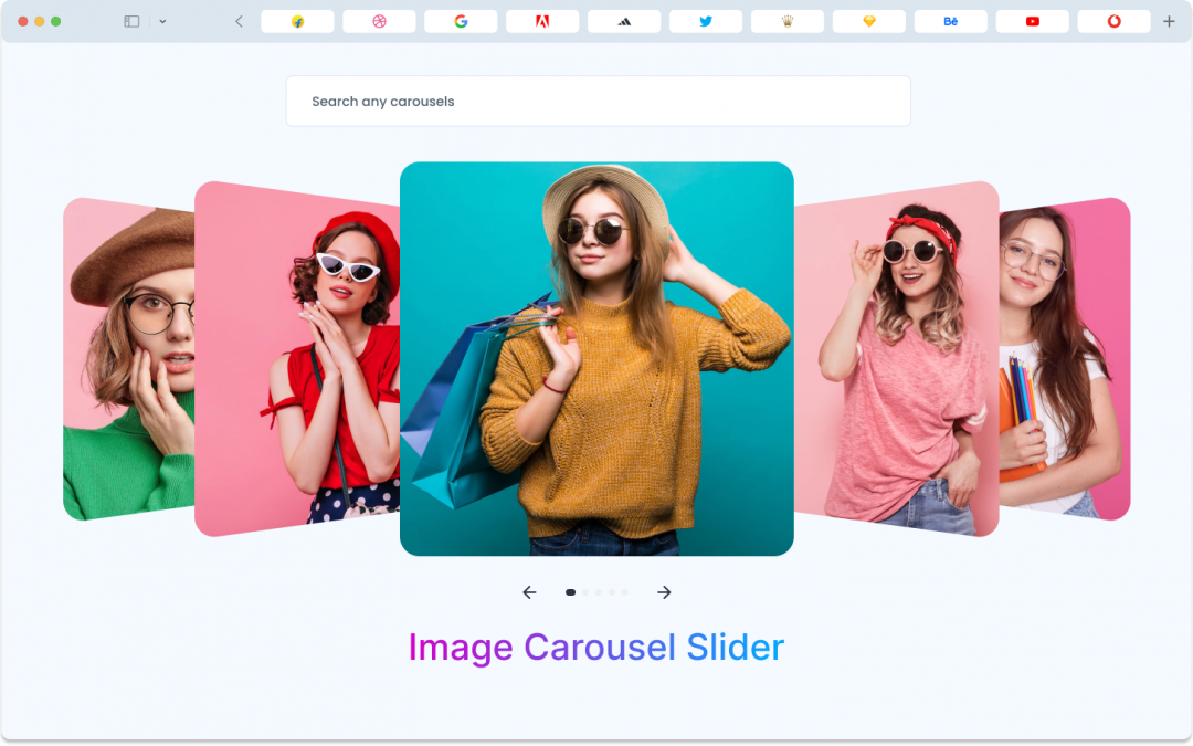
Divi Image Carousel User Guide
Getting Started
The Divi Image Carousel module represents within the divicarousels plugin, the creative journey for designers. It stands out as an asset and a source of pride for the divicarousels plugin. This module is renowned for its innovative approach, significantly simplifying the design process and reducing time investment.
The Divi Image Carousel offers a multitude of features that cater to designers’ needs, including child items, carousel settings, carousel types, advanced carousel settings, customizable content area backgrounds, exceptional typography options, arrow and dot navigation, buttons, custom spacing, and much more. Notably, the child item feature possesses distinctive and attention-grabbing attributes, which can be applied to specific items, while the global settings impact the entire module.
Child Item – Divi Image Carousel
Before we talk about all the fancy stuff in the Image Carousel, let’s check out the Child Item. It’s like adding a special touch to one image at a time. The Child Item has three parts:
- Content Options
- Design Options
- Advanced Options
Child Item Content Tab
In the Content tab of the DiviCarousel Image Carousel Child Item, you’ll find some important features. Designers use these features to set things like the picture, caption, button, and link for a specific item in the module. Don’t worry; we’ll talk about all these features in detail today.
Content Item
- Heading: The main title.
- Subheading: A smaller title or description.
- Image: The picture you want to show.
- Alt Text: A description of the image for accessibility.
- Text Position: Where you want the text to appear on the image.
Link
If you want to send your audience from one item to another page, you can use the Link feature. It lets you create a custom link for each child item. The DiviCarousels Image Carousel module is well-organized, making it easy to customize while you work.
Background
In the Child Items Content tab, you can enhance the look of your layout with various background options. These include changing the background color, using gradients, adding images, or even videos. You can fine-tune these settings to match your preferences. It’s important to note that this background applies to the entire item, which is a default feature in Divi.
Child Item Design Tab
The Design Tab for each child item lets you make each part of an item look really nice. It has some special design options that are quite helpful. You can do things like making changes when someone hovers over the item, adjusting captions, buttons, spacing, borders, and using filters. These might sound tricky, but don’t worry; it’s simpler than you might think. Just follow the instructions below.
Slide Item
In the Slide Item, you have the flexibility to add border radius, customize the border style, and even apply a unique box style. These options give you the freedom to create visually appealing designs for your slides.
Heading
In the Heading section, you can easily change the text styles for your headings. Whether you want to adjust the font, size, color, or other styling elements, this feature allows you to customize the appearance of your heading text to match your design preferences.
Subheading
In the SubHeading section, you can easily change the text styles for your headings. Whether you want to adjust the font, size, color, or other styling elements, this feature allows you to customize the appearance of your heading text to match your design preferences.
Image Settings
Within Image Settings, you have the flexibility to modify various image attributes, including the application of a box shadow. This feature empowers you to fine-tune the visual aspects of your images, ensuring they align with your design vision and requirements.
Spacing
Divi has a default spacing setting for the entire module. There are two common margin and padding settings that work the same way for all Divi modules.
Border
The Border feature in the DiviCarousels Image Carousel lets you round the corners of the container and change the border’s width, style, and color. It might seem a bit confusing at first, but it’s easier to understand when you try it out.
Box Shadow
The Box Shadow feature impacts all the individual items in the Divi Image Carousel module and offers six unique shadow effects that you can customize.
Filter Transform
The transform feature for each child item gives you five different ways to change how it looks. You can scale, move, rotate, skew, and set the origin point for better control over the item’s appearance.
Child Item Advanced Tab
You can accomplish everything you need in the Content and Design tabs, so make the most of these options. However, the Advanced tab in the Divicarousls Image Carousel allows designers to have full control over the entire module. Here, designers can fine-tune each element of the image carousel using CSS ID & Classes and other Custom CSS code. Additionally, you’ll find settings for visibility, transitions, position, and scroll effects to ensure everything works smoothly.
Global Features of Divi Image Carousel Module
Divi Image Carousel Content Tab
Carousel
In the Carousel section, you can configure various settings for your Divi image carousel:
– Carousel Type: Choose between Coverflow and Slider.
– Slider per View: Determine how many items are visible at once.
– Carousel Speed: Adjust the speed of the carousel’s transitions.
– Item Space Between Set the spacing between items.
– Autoplay: Enable automatic scrolling.
– Autoplay Delay: Define the delay between slides.
– Slider Loop: Choose whether the carousel should loop.
– Center Slider: Center the active slider.
– Auto Height: Adjust the carousel’s height automatically.
– Pause on Hover: Pause autoplay when hovering over the carousel.
Navigation
Arrows:
The arrow feature lets designers create attractive and stylish arrows by customizing each part.
Arrow Icon:
In the Arrow Settings, you can pick your favorite icons for the previous and next arrows. You can also choose the icon size.
Arrow Icon Color & Background:
You can change the color of the arrow icons using the arrow icon color option, and you can modify the background color behind the arrows with the background feature.
Arrow Position, Alignment & Opacity:
The Image Carousel’s Arrow feature has settings to adjust the position, alignment, and opacity level of the arrows.
Pagination
The Dots feature allows you to customize the appearance of the dots icon. You can change its alignment and color. You also have the option to give a distinct look to the active dot icon by using the active dot color feature.
Background
In the Content tab of the Divi Image Carousel, you can enhance your layout in several ways. You can change the background color, use gradients, add images, or even incorporate videos. Plus, there are settings that allow you to customize these choices according to your preferences.
Divi Image Carousel Design Tab
Slide Item
In the Slide Item, you have the flexibility to add border radius, customize the border style, and even apply a unique box style. These options give you the freedom to create visually appealing designs for your slides.
Heading
In the Heading section, you can easily change the text styles for your headings. Whether you want to adjust the font, size, color, or other styling elements, this feature allows you to customize the appearance of your heading text to match your design preferences.
Subheading
In the SubHeading section, you can easily change the text styles for your headings. Whether you want to adjust the font, size, color, or other styling elements, this feature allows you to customize the appearance of your heading text to match your design preferences.
Custom Spacing
Custom spacing is a crucial feature of the Divicarousel image carousel module. When you explore this setting, you’ll find two different spacing options:
Wrapper spacing: This lets you control the margin and padding for the entire container, and it’s also easy to set margins and padding for each item within the container. Keep in mind that any changes made here will apply to every slider in the whole module.
Content spacing: Content spacing allows designers to add margin and padding to the button and caption individually. It’s important to note that these adjustments will affect the caption and button for all sliders in the module at once.
Spacing
Divi includes a default spacing setting that works the same way for the entire module. You’ll find two common options for margins and padding in this function, and they apply to all Divi modules.
Border
The Border feature in the Divicarousels Image Carousel module lets you round the corners of the image container. You can also customize the border’s width, style, and color. Don’t be intimidated; it’s easier to understand when you try it.
Box Shadow
Box Shadow affects all the individual items within the Divi Image Carousel module and offers six different shadow effects that you can customize.
Filter
The filter feature is impressive and adds a variety of color effects to the child item. You can adjust settings like hue, saturation, brightness, contrast, opacity, blur, and more to enhance your design.
Transform
The filter feature is impressive and adds a variety of color effects to the child item. You can adjust settings like hue, saturation, brightness, contrast, opacity, blur, and more to enhance your design.
Animation
The animation effect setting is a part of all Divi default modules, including the Divi Image Carousel. It offers seven different effects and additional options to make your animated section look visually appealing.
Divi Image Carousel Advance Tab
You can do everything you need in the Content and Design tabs, so use them for your convenience. But if you want even more control, the Advanced tab in Divicarousel’s Image Carousel lets designers fine-tune every element using CSS ID & Classes and other Custom CSS code. Plus, it offers settings for visibility, transitions, position, and scroll effects to make everything work smoothly.
Class ID & Class
CSS ID: The CSS ID is used to uniquely identify the element when you want to link, script, or style it separately.
CSS Class: You can assign one or more CSS classes to the element, separated by spaces. These classes allow you to apply custom CSS styles either from your child’s theme or Divi’s custom CSS inputs.
Custom CSS
In the Divicarousels Image Carousel module, there are various places where you can add your custom CSS code. Each CSS input box has a “?” symbol, which indicates the targeted class for your reference.
Great, you’ve told us about the module, now where are the instructions on how to implement them?
Or a demo video, there is none on your demo site, just broken links