Getting Started
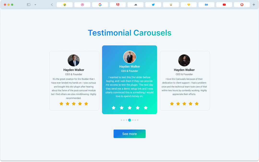
The Testimonial Carousel Module in Divi comes with a range of features, including options for individual testimonials, author details, Carousel and Coverflow styles, arranging items, customizing text and author box backgrounds, and additional elements like brand logos, author box settings, quote icons and images, and spacing adjustments.
Child Item – Divi Testimonial Carousel
Child Item Content Tab
Content Item
Within the Content Item, you can find these key elements:
- Name: The person’s name.
- Designation: Their job title or role.
- Rating: The score or rating is given.
- Content: The testimonial or review text.
- Image: The person’s image.
- Alt: A description of the image for accessibility purposes.
Link
If you want to guide your audience to a different page, the Link feature allows you to create custom links for each child item. The DiviCarousels Image Carousel module is user-friendly, making customization a breeze.
Background
Within the Child Items Content tab, you can use various background options. These options include changing colors, using gradients, adding images, or even videos. You can adjust these settings to your liking. Keep in mind that this background applies to the entire item, as it’s a default feature in Divi.
Child Item Design Tab
Heading
In the Heading section of the testimonial carousel, you can effortlessly modify the text styles. Whether it’s changing the font, size, color, or other style elements, this feature lets you tailor the look of your heading text to suit your design preferences with ease.
Spacing
Divi has a standard spacing setting that functions uniformly across the entire module. This setting offers two usual choices for margins and padding, and these options apply consistently to all Divi modules.
Border
In the DiviCarousels Testimonial Carousel, the Border feature allows you to round the corners of the container and adjust the border’s width, style, and color. While it may seem a bit tricky initially, it becomes clearer when you give it a try.
Box Shadow
The Box Shadow feature affects each item in the Divi Testimonial Carousel individually and provides six distinct shadow effects that you can customize to your liking.
Child Item Advanced Tab
You can handle all your needs using the Content and Design tabs, so be sure to explore these options thoroughly. However, the Advanced tab in the Divicarousls Testimonial Carousel gives designers complete control over the entire module. Here, you can customize every element of the image carousel using CSS ID & Classes and other Custom CSS codes. Additionally, you’ll discover settings for visibility, transitions, position, and scroll effects to ensure everything runs seamlessly.
Global Features of Divi Testimonial Carousel Module
Divi Testimonial Carousel Content Tab
Carousel
Carousel Type: This lets you choose the style of your carousel. You can pick between “Coverflow” and “Slider” to determine how your images will transition.
Slider per View: This controls how many images are visible at the same time within the carousel. It’s like deciding how many photos you can see in one glance.
Carousel Speed: This setting allows you to change how quickly the images move from one to the next in your carousel. It’s like adjusting the speed of a slideshow.
Item Space Between You can set the space or gap between each image in the carousel. It’s like deciding how far apart the pictures should be.
Autoplay: When enabled, this feature makes the carousel automatically scroll through the images without needing manual interaction. It’s like setting your carousel on autopilot.
Autoplay Delay: This defines the amount of time between each slide when using the autoplay feature. It’s like setting the pause duration between one picture and the next.
Slider Loop: You can choose whether the carousel should start over from the beginning once it reaches the last image. It’s like deciding if the carousel should keep cycling.
Center Slider: This option helps you center the active image in the carousel, making it stand out. It’s like ensuring the current picture is in the spotlight.
Auto Height: This setting adjusts the height of the carousel automatically based on the content. It’s like making sure the carousel is the right size for the images it contains.
Pause on Hover: When this is enabled, the autoplay feature will pause when you hover your mouse over the carousel. It’s like putting a temporary stop to the automatic scrolling when you interact with it.
Order Items
This is like a tool or system that helps you arrange or organize your testimonial elements in a specific sequence.It’s like arranging pictures on a bulletin board in the order you want them to be seen.
Navigation
Arrows:
The arrow feature lets designers create stylish arrows by customizing each part.
Arrow Icon:
In the Arrow Settings, you can choose your favorite icons for the previous and next arrows, as well as adjust their size.
Arrow Icon Color & Background:
You can change the color of the arrow icons and the background behind them.
Arrow Position, Alignment & Opacity:
The Image Carousel’s Arrow feature allows you to tweak the position, alignment, and opacity of the arrows.
Pagination
Dots:
The Dots feature allows you to personalize the appearance of the dot icon, including its alignment and color. You can also make the active dot icon stand out by changing its color.
Background
In the Content tab of the Divi testimonial Carousel, you can enhance your layout by adjusting background settings. This includes changing background colors, using gradients, adding images, or even integrating videos. You have the flexibility to customize these choices to match your preferences.
Divi Testimonial Carousel Design Tab
Slider Item
This is like a frame around the content, kind of like a picture frame. It helps to define the boundaries and appearance of the testimonial section.
Image
This is where you can insert a picture of the person who gave the testimonial. It adds a personal touch to the testimonial
Name
This is the full name of the person who wrote the testimonial. It’s important to know who is sharing their feedback.
Designation
This is the person’s job title or position. It tells us what the person does for a living or their role in a company.
Content
This is the actual testimonial message or review. It’s what the person has written about their experience or thoughts. This is the heart of the testimonial.
Rating
This is a score, usually from 1 to 5, that represents how satisfied the person is. It’s like giving a grade to their experience, with 5 being the best and 1 being the worst. It helps others quickly understand how positive or negative the testimonial is.
Custom Spacing
Custom spacing is a crucial feature of the Divicarousel testimonial carousel module. Within this setting, you can find two spacing options:
Wrapper spacing: This controls the margin and padding for the entire container, making it easy to set margins and padding for each item within the container. Note that changes here affect every slider in the module.
Content spacing: Content spacing allows designers to add margin and padding to the button and caption individually, affecting all sliders in the module.
Spacing
Divi has a default spacing setting that works consistently across the entire module, offering options for margins and padding that apply to all Divi modules.
Border
The Border feature in the Divicarousels Testimonial Carousel module allows you to round the corners of the item container and customize border width, style, and color. It’s easier to grasp when you give it a try.
Box Shadow
Box Shadow impacts each item in the Divi testimonial Carousel module individually, offering six customizable shadow effects.
Filter
The filter feature adds various color effects to child items, with options to adjust hue, saturation, brightness, contrast, opacity, blur, and more.
Transform
Similarly to the filter feature, transform effects can be applied to child items, offering control over scale, translation, rotation, skew, and origin.
Animation
The animation effect setting, present in all Divi default modules, including the testimonial Carousel, provides seven different effects and additional options for eye-catching animations.
Divi Testimonial Carousel Advance Tab
While the Content and Design tabs cover most needs, the Advanced tab in Divicarousel’s Testimonial Carousel offers extensive control. Here, designers can fine-tune elements using CSS ID and classes and add custom CSS code. It also includes settings for visibility, transitions, position, and scroll effects
Class ID & Class
CSS ID and CSS Class are used for unique identification and applying custom styles to elements.
Custom CSS
In the Divicarousels Testimonial Carousel module, you can add custom CSS code in various places, with each CSS input box providing a reference for the targeted class.