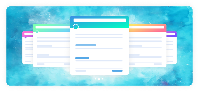
Divi Advance Content Carousel
Once you have installed DiviCarousel Module, you will find Divi Content Content alongside the rest of the Divi Modules that are available in the “Insert Module” window.
Inside the content toggle, there are new four accordions that will show.
- Content Settings
- Navigation Settings
- Pagination Settings
- Effects Settings

Carousel Settings
In carousel settings you can select options it will show as slider or coverflow. How many slider items will show in slider. The speed of the slider, between the distance of two slider items. The default value of the slider is coverflow with 3 slider items. You will get full control over the image content to show its position.
Carousel Type: The carousel can be shown on a slide or coverflow
Slide Per View: You can set how many sliders will show
Carousel Speed: Speed or slider can be set and it will be milliseconds
Item Space Between Default space between slider items is 15px you can change it as you need.
Auto Play: The default setting is an auto play but you can change it.
Auto Play Delay: After how many milliseconds the slider will start you can set it.
Slider Loop: Default the slider loop is infinity but you can restrict it.
Center Slide: The default slider is center but you can set it from the start
Auto Height: Default auto height is on.
Content Show/Hide: You can determine whether only the image will show or hide. The default is on.
Image Show/Hide: You determine only content will show or hide. Default is on
Learn More Show/Hide: Default is on. You can hide it.
Learn More Alignment: The alignment of buttons can determine. The default is center.
Navigation Settings

Navigation Show/Hide: Default navigation will show in your slider but you can hide it.
Customer Arrow Icon
- Left Icon
- Right Icon
Easily can set the left arrow and right arrow icons from the Divi icon library.
Position:
- Vertical Position
- Horizontal Position
Vertically you can set the top center and bottom position for the arrow.
It has 6 options to set the horizontal position of the arrow.
Icon Size: Arrow Icon can be adjusted
Background Size: Arrow background size can be set
Background Size Hover: Arrow background hover size can be set
Radius: Arrow can be a rectangle or circle by setting the radius
Icon Color: Arrow color can be set
Icon Color Hover: The arrow hover color can be set
Background Color: Arrow background color can be set
Background Color Hover: Arrow background hover color can be set
Pagination Settings
Pagination Show/Hide
Use Grab Cursor
Use Keyboard Navigation
Use Mouse Wheel Navigation
Pagination alignment
Bullet Type
Dynamic Bullet
Bullet Color
Bullet Size
Effects Settings

Slider Shadow
Shadow Color Dark
Shadow Color Light
Slide Rotate
Slide Stretch
Slide Depth
Design

Slide Item Settings
Title Settings
Content Settings
Image/Icon Settings
Button Settings
Custom Settings
Divi Advance Content Carousel Item
Carousel Item
Overlay Settings
Hover Effect
Design
Slide Item Settings
Title Settings
Content Settings
Image/Icon Settings
Button Settings
Custom Settings
Divi Carousel
Divi Carousels Plugin is the ultimate solution to create any Divi sliders. We are working to build a better Carousel slider for Divi builder for the last 2 years.


